Temperature Blankets
My partner decided, towards the end of the Christmas holidays, to get obsessed with temperature blankets. Temperature blankets, are blankets that also function as a record of the temperature for a given period. As an example, this blogpost describes a blanket intended to record the temperature for a given year, with each row being a day. The temperature for each day then determines the colour that each particular row will have.Of course, there is nothing stopping you from creating a blanket recording a day, with each row (or set of rows) being an hour.
While there are obvious a lot of considerations to take into account for such a project, I would be completely unaware of them, so I will only discuss the ones that touch upon my interests. No matter what period you are looking to base your blanket on, there are a couple of things you need to figure out.
- What are the temperatures for the given period?
- How will you decide on temperature bands?
- What colours will you use to correspond to each temperature band?
The first thing you need is a reliable list of temperatures. There are ways to get these, but it can be difficult to get them in bulk ( if you need, say 365 days worth of temperatures). I used the Weather Underground API and wrote a script in R to get the temperatures and organise them into a format where I could manipulate the numbers, but that may not be for you.
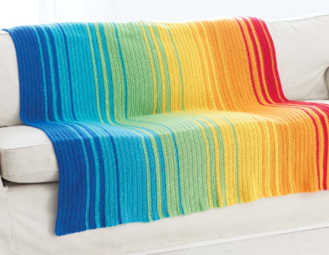
Weather blanket found on The Crochet Crowd.
I did spot a nice app on the Weatherghan site, which not only gives you the temperatures, but also generates a pattern for you based on the temperatures. The problem with this site is that it has preset temperature bands, which means that unless you are from somewhere with a wide range of temperatures (and we are talking American Midwest wide), you will not necessarily end up with that much colour variation in your blanket. In addition, you may not like the colours, or it is difficult to get those particular colours in a type of yarn you enjoy working with and so on.
Because of this, I assume that whoever does a temperature blanked like this have decided on a set of colours they like. There are many ways that you can do this, but most people seem to go with “colder” colours like blues on one end and “warmer colours” like yellows and reds on the other.
Once you have decided on the colours you want, you need to determine the range of bands and the colours to go in them. The most straightforward way of doing this is to take number of different colors that you have and divide it by the range of temperatures that exist for that period. The range can be arrived at by subtracting the low tempereture from the high temperature.
Imagine you have the following (the temperatures are from Hatfield, Hertfordshire, and the period is the year that our son was born):
- 7 colours of Yarn
- High Temperature of 24 degrees
- Low temperature of -2 degrees
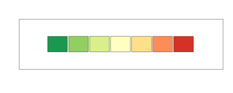
The 7 different colors that I have
The range is 24- (-2) which is 26 degrees. Divided by 7, we get that each band correspond to 3.7. This is not exactly ideal, so we can pad it out to -3 to 25 which gives us a range of 28 degrees (which gives us each band being 4 degrees wide).
The first band will then consists of the temperatures between -3 and 1, the second will consist of 2 to 5, the third of 6 to 9 and so on.
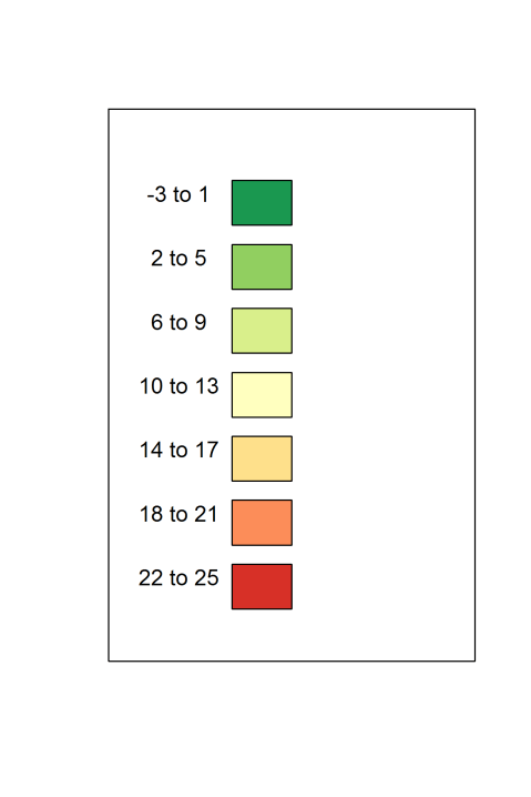
Temperature Bands with colors.
While this is a good start, and it does show us all the colors that will be in the blanket, it doesn’t really tell us what our blanket will look like in the end. To do this, we need to look at the spread of temperatures.
One way of doing this is to use percentiles. In everyday life, the only time I come into contact with the concept of percentiles is whenever my son gets measured for something or other, such as height, weight, reading ability etc. Basically they tell us what percentage of all observations lie below a specific observation. For instance, my son was really thin in his first year, and consistently lay around the 10th percentile for his height. This meant that only 10 percent (or one in 10) of children his height would weigh less than him. However, while short, he wasn’t that short, and so was normally around the 20th percentile for his height, which meant that only 20 percent (or one in five) of all children his age would be shorter than him. The converse was true as well, so 80 percent of children his age would be taller, and 90 percent of children would weigh more.
Returning to our particular set of temperatures we have the following percentiles:
- 0 percentiles (or lowest score): -2
- 25th percentile: 6
- 50th percenitle: 10
- 75th Percentile: 14
- 100 percentile(or highest score): 24
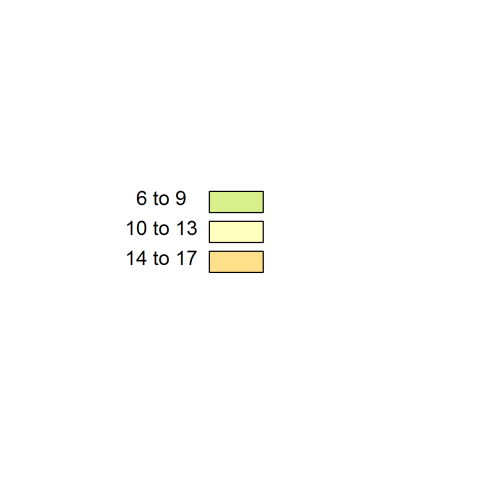
The range between the 25th and the 75th percentile is sometimes called the interquartile range(because it goes between the lowest and the highest quarter), and represents the middle half of observations. Basically, half of your blanket will be whatever colours correspond to the range between these values. In my case that would be between 6 and 14 degrees.
So half of my blanket will consist of these colours, which is not very exciting:
At least half of the time.
In fact, if we were to use percentiles to see how much we would use of each colour, the numbers would be a bit like this:
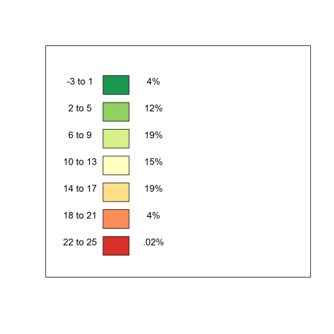
Approximate percentage of use for each colour.
Here we see that our nice dark red would only see use less than once every 200 days! Also, it means that we would have to watch how much yarn we are to buy of each colour, as we we would use far more yarn of the middle colour than those towards the edges. What should we do?
Well, one solution is to use percentiles instead. This way, instead of using bands defined by a set number of degrees we use bands defined by the percent of days. The first band will be the 10% of days with the lowest temperature, the next band will be between 10 and 20 percent, and so on. To do this we will use 8 colours (because it is easier to work with than 7).
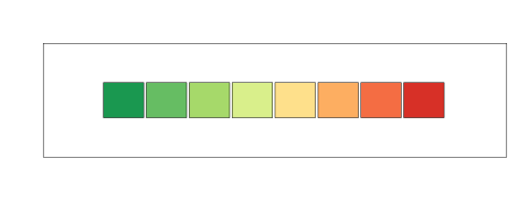
8 Color Palette
Now that we have decided on this, we can then move on to deciding whether or not each should get an equal share or whether or not there should be differences. I was in favour of having equal shares, which means that each color could be seen one-eights (or 12.5%) of the time, this would give us a palette like this.
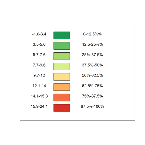
Equalised Range
I showed the above graph, proudly to my partner, who immediately disagreed with this approach. She did not want a homogenous approach, but was happy with having rare colours being used for the most extreme temperatures. She suggested that after you have determined the where the percentiles lie, you can decide on colours you find aesthetically pleasing for the middle range, for instance to match the colours of the room that you intend the blanket to be in. However to do this, it is a very good idea to assess where the percentiles lie, so that you know before hand what colours you will see most often.
If you have a list of the temperatures for a given period and access to Microsoft Excel, finding the percentiles is fairly straightforward, by using the (aptly named) PERCENTILE function, you type in PERCENTILE followed by the range of temperatures and the percentile you are interested in. So for instance, if you had the temperature data in the cells A1:A366, you could replicate my approach using the following Excel Commands
=PERCENTILE(A1:A366,.125)
=PERCENTILE(A1:A366,.25)
=PERCENTILE(A1:A366,.375)
=PERCENTILE(A1:A366,.50)
…and so on. You can go to Excel Easy for a more detailed explanation of how excel generates percentiles for you.

Recent Comments